

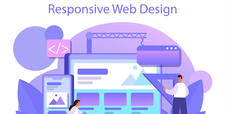
In today’s fast-paced digital world, ensuring that your website functions seamlessly across multiple devices is essential. As mobile usage continues to rise, businesses are shifting toward responsive web design to cater to the diverse needs of their users. If you are looking to improve your website’s user experience and functionality, responsive web design is the key to delivering a seamless, engaging experience for visitors, no matter what device they are using. At Designfolive, we specialize in creating responsive websites that not only look great but also perform efficiently across all platforms. Whether you are a small business or a large corporation, our responsive web design services in Kolkata, West Bengal, are tailored to elevate your online presence.
What is Responsive Web Design?
Responsive web design is an approach to web development that ensures a website’s layout and content adjust automatically to fit different screen sizes. Whether your visitors are browsing on a desktop, tablet, or smartphone, the website will adapt, providing an optimal viewing experience. The core of responsive design lies in the fluid grid system, flexible images, and media queries that work together to create a dynamic interface.
At Designfolive, we focus on building responsive websites that are not only visually appealing but also user-friendly and functional across a range of devices and screen sizes. This ensures that your audience can easily interact with your website, regardless of the platform they are using.
The Importance of Responsive Design for Businesses
- Enhanced User Experience
The primary benefit of responsive design is an improved user experience. Users are more likely to stay on a website that is easy to navigate and visually appealing across all devices. A well-designed, responsive website ensures that visitors can easily find what they need without having to zoom in or scroll excessively. - Increased Mobile Traffic
As mobile traffic continues to rise, it’s crucial to have a website that is optimized for mobile users. With more people accessing the internet via smartphones and tablets, a responsive design ensures your website is always accessible to a broader audience. This is especially significant in Kolkata, where mobile internet usage is growing rapidly. - Better SEO Performance
Search engines like Google prioritize mobile-friendly websites in their search results. Having a responsive website ensures that you don’t need separate mobile and desktop versions of your site, which can be difficult to manage. Google’s mobile-first indexing means that responsive websites are more likely to rank higher in search results, giving you a competitive advantage. - Cost-Effective and Time-Saving
Rather than building separate websites for desktop and mobile users, a responsive design allows businesses to maintain a single website that works across all devices. This can save both time and money in the long run, especially for businesses in Kolkata that are looking to optimize their online presence without additional overhead costs.
Why Choose Designfolive for Responsive Web Design in Kolkata?
At Designfo live, we understand the unique challenges businesses face when creating a website that performs well on all devices. Our team of experienced designers and developers work closely with clients to deliver custom-responsive web designs tailored to their specific needs. Here are a few reasons why businesses in Kolkata trust us with their responsive web design needs:
- Expertise and Experience
With years of experience in the web design industry, Designfolive has honed its skills in responsive design to deliver high-quality websites that perform flawlessly on all devices. Our team stays updated with the latest design trends and technologies to ensure that your website is built using modern techniques. - Custom Solutions for Every Business
We recognize that every business is unique, and we take a personalized approach to responsive design. Our team works closely with clients to understand their brand identity, goals, and target audience to create websites that are not only responsive but also aligned with their business objectives. - User-Centered Design
At Designfolive, we prioritize the user experience. Our responsive web designs are created with the end-user in mind, ensuring intuitive navigation, fast load times, and engaging content. We focus on creating websites that are easy to use and provide a seamless experience for your visitors. - Mobile-First Approach
Given the increasing importance of mobile traffic, we take a mobile-first approach to responsive design. This means that we prioritize designing your website for mobile devices first and then adapt it for larger screens. This ensures that mobile users have the best possible experience when visiting your site. - Ongoing Support and Maintenance
Responsive web design is an ongoing process. As devices and technology evolve, your website needs to adapt to these changes. Designfolive offers ongoing support and maintenance services to ensure your website continues to perform well and provide an excellent user experience across all platforms.
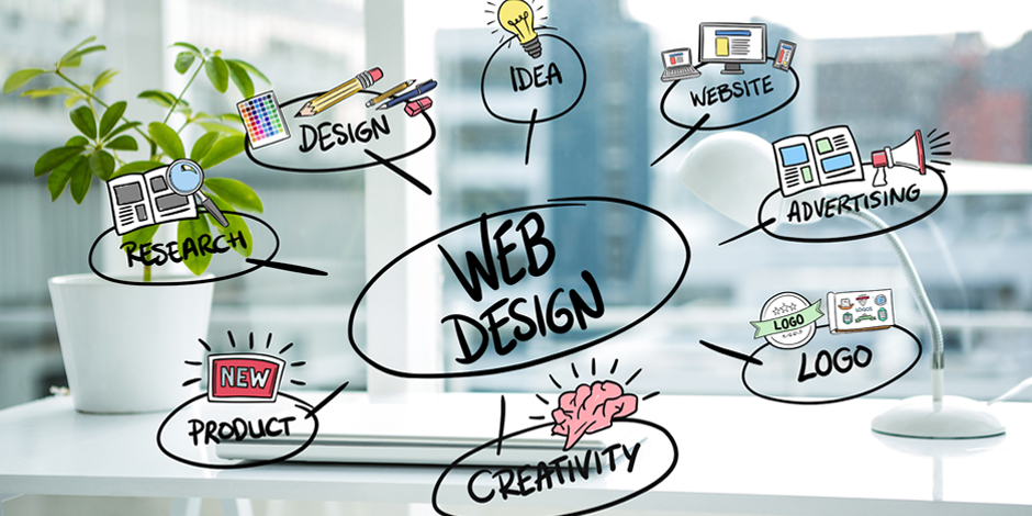
Key Features of Responsive Web Design by Designfolive
- Fluid Grid Layouts We use a fluid grid system to ensure that your website’s layout adjusts proportionally to the screen size. This allows your website to maintain its design integrity, whether it’s being viewed on a smartphone or a large desktop monitor.
- Flexible Images Images on a responsive website should resize depending on the screen size to avoid any distortion or stretching. Our team optimizes images so they look great on all devices, ensuring fast load times and smooth performance.
- Media Queries Media queries allow us to apply different styles based on the device characteristics, such as screen width and orientation. This enables us to fine-tune your website’s design for each specific device, providing the best possible experience for users.
- Touchscreen-Friendly Design With the increasing use of touch devices, we ensure that our responsive designs are optimized for touchscreens. Buttons and links are appropriately sized, and interactive elements are easy to use on mobile devices.
Conclusion Responsive web design is no longer optional for businesses in Kolkata. It’s essential for reaching your audience effectively, improving user experience, and boosting your online visibility. At Designfolive, we offer expert responsive web design services that ensure your website works flawlessly on any device, from smartphones to desktops. Whether you are a new startup or an established brand, we have the skills and experience to create a website that not only looks great but also performs exceptionally.
Get in touch with us today to take your online presence to the next level.
Call: +91 983-1037-463 Mail: help@designfolive.com
Comments are closed